Australian Modernism’s Top 10: Part Two
Australia’s modernist movement had an enormous impact on the urban and cultural fabric of our country throughout the 20th century. Part one of this article explored buildings including the Sanitarium Health Food Company Factory in Warburton and Lobster Bay House in Pretty Beach, New South Wales.
In part two, architectural historians Hannah Lewi and Philip Goad continue their dive into Australian modernism’s rich architectural legacy.
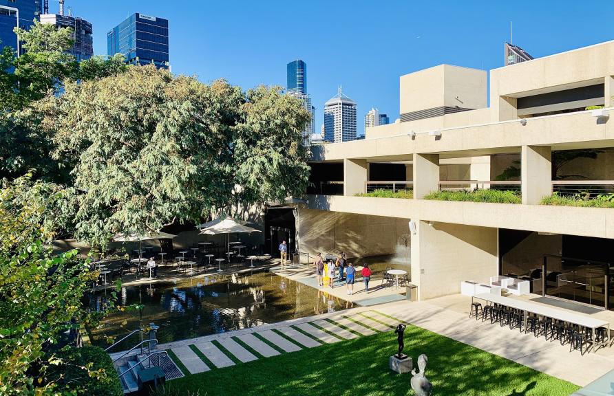
Robin Gibson designed the gallery after a world tour of similar institutions. Picture: Wikimedia
Australian Academy of Science
Design: Grounds, Romberg & Boyd
Construction: 1956-59
Location: Canberra, Australian Capital Territory
Professor Philip Goad: The auditorium of Roy Grounds’s Australian Academy of Science (now the Shine Dome) is one of the great interiors of Australian post-war modernism.
Scientists could lounge in super comfortable double ‘settees’, designed by Fred Ward and upholstered in fabric supplied by Australian textile designers, eclarté.
Around them timber battens on the surrounding curving wall produced a Moiré Pattern that sent many of them to sleep – so strings had to be inserted between each batten specially to stop this visual phenomenon.
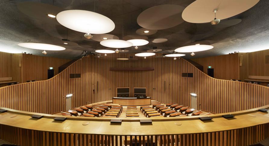
The conference chamber features floating discs of different sizes. Picture: Christine Francis
Above, the conference chamber has a ceiling of floating plywood discs of different sizes and distances from the concrete shell above. The overall effect is like a magnified Milky Way dotted with stars that are in fact lights.
While nicknames for the thin-shell, scalloped dome building like ‘Beehive for Boffins’ and ‘Martian Embassy’ abounded at the time, the Academy of Science has come to be admired and revered.
Its restoration was completed in 2001.
Foulkes Taylor showroom
Designer: Julius Elischer
Construction: 1965
Location: Nedlands, Western Australia
Professor Hannah Lewi: For anyone who studied architecture in Perth, this building located adjacent to the University of Western Australia campus, has endured as an inspiration, with many sketching expeditions mounted to study its modelling of light and shade.
Designed by Julius Elischer for the Perth patron of modern design David Foulkes Taylor, the building was commissioned to showcase and sell furniture from the mid-1960s onwards.
Inspiration from the famous architect Le Corbusier is visible in the artfully arranged windows of coloured glass punched into the bagged, white brick façade.
It was given a new lease of life in 2005, when purchased by the Western Australian Institute of Architects and renovated by Bernard Seeber Architects.
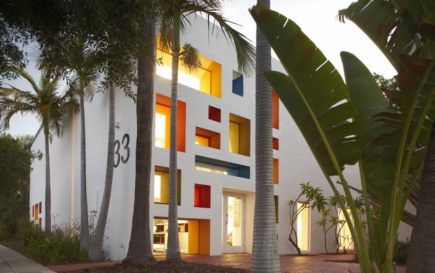
The building was commissioned to showcase and sell David Foulkes Taylor’s furniture from the mid-1960s. Picture: Robert Frith
ST MARY’S STAR OF THE SEA WAR MEMORIAL CATHEDRAL
DESIGN: DONOGHUE, CUSICK & EDWARDS
CONSTRUCTION: 1955-62
LOCATION: DARWIN, NORTHERN TERRITORY
Professor Philip Goad: How do you build a modern cathedral in the tropics? What form might it take?
The Brazilians knew how and St Mary’s Star of the Sea takes its cue from the catenary arches of Oscar Niemeyer’s concrete shell vaults of St Francis of Assisi at Belo Horizonte built in 1943.
But otherwise this Darwin church is completely different.
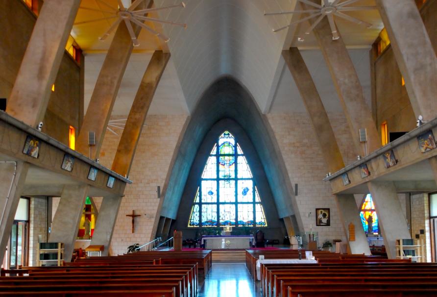
St Mary’s Star of the Sea was built between 1955 and 1962. Picture: David Bridgman
It has a campanile (tower) of local porcellanite stone and, instead of a single concrete form, it is a ribbed series of catenary arches with projecting rectangular bays to either side and it has a traditional ‘crossing’.
The entire length of both nave walls can be opened up by a series of glazed doors and above, off-centred windows puncture blank walls and at eaves level, a concrete grill runs the full length of the building’s eaves – all for maximising ventilation.
Inside, an unusual feature is artist Karel Kupka’s depiction of the Virgin Mary and Child as Indigenous Australians.
Macquarie University Campus
Design: New South Wales Government Architect’s Office
Construction: 1964-76
Location: North Ryde, Sydney
Professor Hannah Lewi: The 1960s witnessed a surge in building for higher education and training. With the sector growing rapidly, it was an important testing ground for Australian architects, landscape designers, planners and artists.
The Macquarie campus is a highly significant example of this boom.
This multi-stage building and landscape program created a unified ensemble of strong off-form concrete and brick buildings, linked by landscaped courtyards and bush planting.
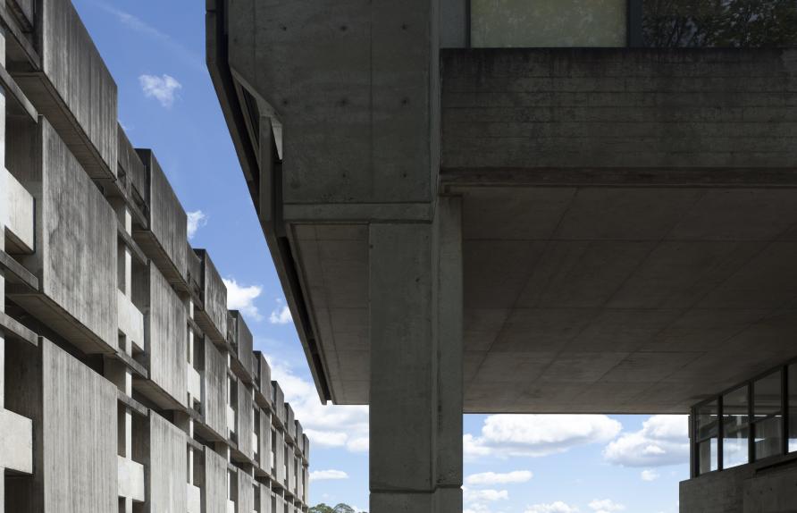
Macquarie University campus features strong off-form concrete and brick buildings. Picture: Richard Glover
In particular, the library, with dramatic square concrete shading panels on its façade, formed a striking focal point for students and the new university community.
Today, like all universities of this era, the original unity of the campus faces significant pressures through ongoing redevelopment and maintenance programs.
Queensland Art Gallery
Designer: Robin Gibson & Partners
Construction: 1973-82
Location: South Bank, Brisbane
Professor Philip Goad: Still a modern classic, the Queensland Art Gallery has magically survived despite changes all around it, to both the Gibson-designed library and his theatres building next door.
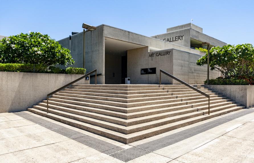
Queensland Art Gallery was also part of a move to reclaim and reinvigorate neglected river-side sites. Picture: Wojtek Gurak
Perhaps what makes this gallery feel timeless is its beautiful top-lit ‘Watermall’, one of the finest modern Australian gallery interiors of the 1970s.
Gibson designed the gallery after a world tour of similar institutions and what he produced was, in effect, a critique of and an improvement upon other better-known and more celebrated galleries such as Kevin Roche’s Oakland Museum of Art (1961-68).
Better lit within, better suited to its riverside site, with durable surfaces like travertine and off-white precast concrete panels, the Queensland Art Gallery was also part of a move generally in the 1970s to reclaim and reinvigorate neglected river-side sites in Australian cities as highly desirable, public open urban spaces.
Words by Professor Hannah Lewi and Professor Philip Goad and originally published in Pursuit


